Hyundai turns to Europe for style boost
BY PHILIP LORD | 25th Oct 2007

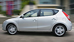
The company’s general manager of global engineering and design, Raphael Bretecher, who is based in Russelsheim told GoAuto during a recent Australian visit that the new i30 is the first example of the company’s new style.
“We wanted to have a car which is not too Korean, which means we wanted to have the kind of clarity in design that you have in Europe that sometimes we did not have at Hyundai in the past,” Mr Bretecher said of the i30.
“You can see the beltline, for example, it is a very clean line on the car. Even though you have this very big negative surface in the rear, it is still a very, very clean design.
“The graphics are logical, not overdone, and the grille shows the design philosophy of Hyundai.”Mr Bretecher thinks that grille design is what will make or break Hyundai - in Europe at least.
“In Europe, if you don’t have a recognisable front end, for a range of models in the brand, you’re dead,” he told us.
“You don’t sell cars in Europe if you change constantly, if you always change the front, they don’t recognise the brand.”

There are competing interests in the Hyundai design world, and Mr Bretecher has to argue for the European point of view.
“What we try to do in Europe is to say to our Korean and American colleagues, let’s make a front end which is going to be the face of Hyundai in Europe and America and in Korea. We are not sure if the Americans and Koreans are following us with that, but in Europe it is very, very clear.”Hyundai’s European design centre shows that the Korean company wants to be taken seriously in the world of design.
“We are part of the whole industry, and there are companies that are taking the future really seriously, and I think we are part of it at Hyundai,” said Mr Bretecher.
“We are trying to get away a little bit from this design that was a bit in the 1990s, very square, very organised. The Audi TT was a perfect car in my opinion, but it’s the end of it. We have to move on.”There are also competing interests at Russelsheim, and Mr Bretecher says that he had to be careful to keep apart the design strategies of Hyundai and its subsidiary brand Kia.
“Our first intention is to differentiate from Kia,” he said. “Because we are all working the same brand, we want to make sure that the cars we are doing are different from Kia.
“We are all about sculptural surfaces, about interesting lines, very dynamic lines and playing with proportions. The inspiration for that is more what you can find in nature. And Kia would be more a product design it’s more technical.”
Read more:
First drive: Hyundai i30 guns for small-car goldSeoul mates