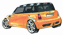
News - Mini - HatchNew Mini a visual icon like Porsche 911Good design: The modern Mini has been massaged, not messed up. Preserving the style overrode any ego tripping, according to R56 chief designer16 Oct 2006 THE person behind the look of the latest Mini likens the model to Porsche’s 911. According to the chief designer of the R56 Mini project, Mr Gert Hildebrand, the Mini is now a visual icon on a par with the long-lived Porsche. "Mini is now in the company of the Porsche 911. Unaltered design over a long period of time will do that," he revealed to GoAuto earlier this month. Mr Hildebrand, 52, is a believer that any good design – given the opportunity to stay for an extended period of time on the market – will eventually achieve icon status. "The best example is the Porsche 911... the Golf too, and the original Beetle. It is the consistency (that people respond to)," he said. The Beetle-collecting designer (he has two Karmann Cabriolets – a 1977 model and one of the last of the line, a 1979 edition) joined BMW Group Design to work on the Mini in the year of the current (R50) model’s launch in 2001. The first fruit of his influence can be seen in the 2004 Mini facelift, which mainly involved a cleaning up of the front and rear-end graphics. Mr Hildebrand and his team were not given "... any concrete orders" or directives from BMW as far as the R56’s design outcome was concerned. However, he did not want to stamp his personality or ego on the car at all – quite the contrary, his major concern was to preserve the very essence of what the Mini stood for. "This is not my design," he told GoAuto, describing his role as a sort of torchbearer for the original. As a result, Mr Hildebrand jokes, the hardest part of the job had already been done for him. The new Mini ended up being the work of stylist Marcus Syring, under Mr Hildebrand’s direction. The design chief was wary of the fine line between preserving the classic Mini looks and proportions, while making it fresh enough for people to update to. "People want to see evolution (in design)," Mr Hildebrand said. In the end, three main factors – the need to make the Mini easier and cheaper to build to increase production in order to meet demand the ability to better meet future crash-test regulations and to desire to fit more powerful engines –helped shape the 2007 model’s visage. Mr Hildebrand seized the model change as an opportunity to instil a slightly more pronounced wedge profile, as a result of the extra length required for the R56 to pass global crash test regulations. At the same time, he injected a more muscular appearance, aided by the shallower depth of the side windows, which resulted from the higher bonnet line and slightly longer bustle back. The latter was necessary in order to retain the classic Mini proportions, which is arguably the most vital element of the brand’s design.  In fact, keeping the Mini’s proportions was probably Mr Hildebrand’s proudest achievement. There is also a suggestion that this was the hardest thing for the design team to get absolutely right. In fact, keeping the Mini’s proportions was probably Mr Hildebrand’s proudest achievement. There is also a suggestion that this was the hardest thing for the design team to get absolutely right.He said that his team started the evolutionary design process organically, by literally grafting the R56 nose to a R50 Mini centre and then working the rest of the car from there, to arrive at a balanced and harmonious result. Mr Hildebrand admits that one the biggest challenges the department then faced lay with the implementation of the details. The headlight shape and size proved controversial within the department, as did the application of the black band around the wheel arches, a move necessitated by the use of smaller wheels on the base models to improve that model’s appearance. The team was also careful for the redesign to not pander to the lure of any stylistic fad going on at the time, a common pitfall for many designers. It is worth noting that the R56 Mini’s design was frozen in about March 2004, some 30 months before the September 1, 2006 production start. Interestingly, the blacked-out C-pillar, created that way for a ‘floating roof’ affect, is deemed a classic Mini styling cue, yet does not have a precedent in the 1959-2000 original. "(That’s because) the 1997 Frankfurt Mini Concept had it," says Mr Hildebrand, explaining that from that point on the floating roof look has become synonymous with the model. Gert Hildebrand has been behind the look of several popular vehicles, most notably the 1992 Volkswagen Golf Mk3, and the 1998 Seat Leon and Seat Toledo. He has also contributed to the 1998 Volkswagen Bora, the 1985 Opel Kadett E that we saw in Australia as the popular 1994 Daewoo 1.5i, and the European version of the current Mitsubishi Colt. The Japanese company was his last port of call before joining BMW Design. As a child, Mr Hildebrand coveted all the original (ADO15) Mini derivatives – even the obscure models like the Ogle coupe, GT and Riley Elf. He is also a fan of the ADO16, the original Mini-based four-door sedan that became Britains best-selling car in the 1960s, the Austin/Morris 1100/1300 series. "I love that car," he told GoAuto. "It is one of my all-time favourites." So what does the outgoing R50 Mini’s designer, Frank Stephenson (now head of Fiat Design) think of the new model? "At the Paris show Frank went up to me and said: "What have you done to my headlights! "But, jokes aside, he said he loved it," Mr Hildebrand said. |
Click to shareMini articlesResearch Mini Hatch pricing
Motor industry news |


Facebook Twitter Instagram